
Timeline
2020 - 2021
Team
Akanksha (Product Manager), Suyog Patel (Product Designer), Sriyash Naik (Product Analyst)
Methods
User Research, Information Architecture, Wireframing, A/B Testing, Data Analysis
Nykaa Fashion web and mobile app navigation redesign overview.
Nykaa Fashion (an e-commerce platform in India) was scaling fast, more brands and categories made navigation harder, which hurt product discovery. I led a cross-functional redesign of the navigation and information architecture to make browsing intuitive and scalable. We validated the new structure with user research and A/B testing and shipped a navigation system that improved discoverability and supported future catalog growth.
As the catalog expanded, users struggled to find the right brands and categories quickly. The existing navigation didn’t scale with the platform, users got “lost,” filters felt heavy, and category paths weren’t predictable. At the same time, we needed business real estate to add new brands and products. So, we asked:
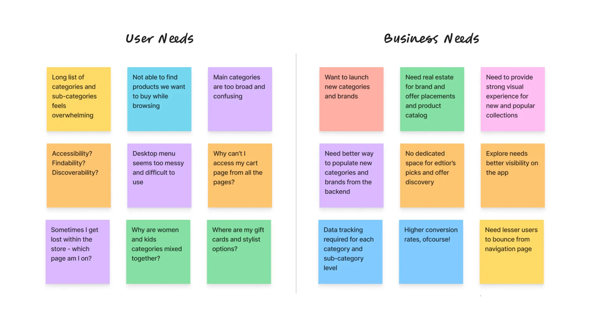
Mapping user needs against business goals to identify key areas of focus for the navigation redesign.
We combined qualitative and quantitative inputs:
— interviews, surveys, contextual inquiry (remote + pandemic constraints)
— stakeholder conversations (merchandising, growth, content)
— funnel and behavioral data (where users dropped, where they got stuck)
Key findings:
— Users expected category paths that match how they shop (occasion, product type, gender, brand)
— The menu structure forced too many decisions too early
— Some categories were hard to locate because naming and grouping didn’t match user mental models
— Users relied on search when browsing failed—often as a workaround, not a preference
We storyboarded how people shop in real life (malls / stores): users start broad, narrow based on intent, then compare options. That journey became the model for a digital browse path: start simple → narrow gradually → keep orientation.
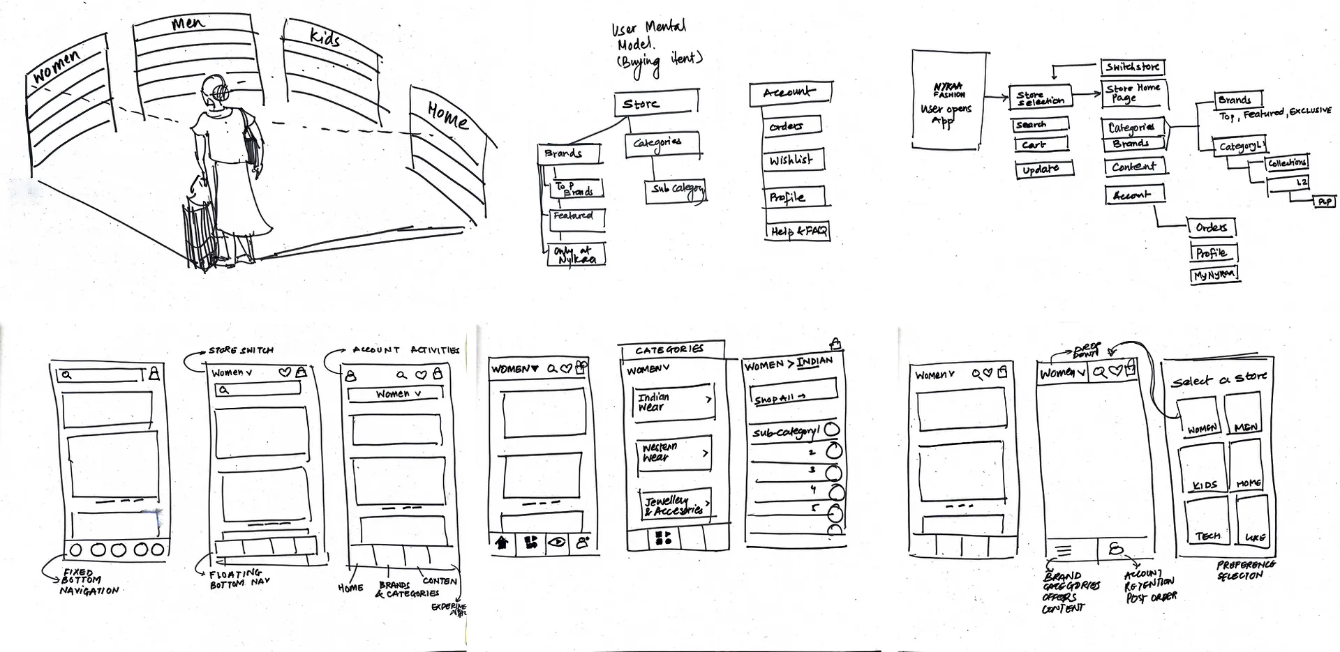
Early brainstoring sessions of user navigating the store, online and offline. Credits: Our Product Designer, Suyog Patel.
We redesigned the information architecture so users could quickly recognize the right path, browse with fewer clicks and fewer dead ends, and stay oriented about where they were in the category hierarchy. The goal was to make exploration feel obvious and lightweight, especially as the catalog kept growing.
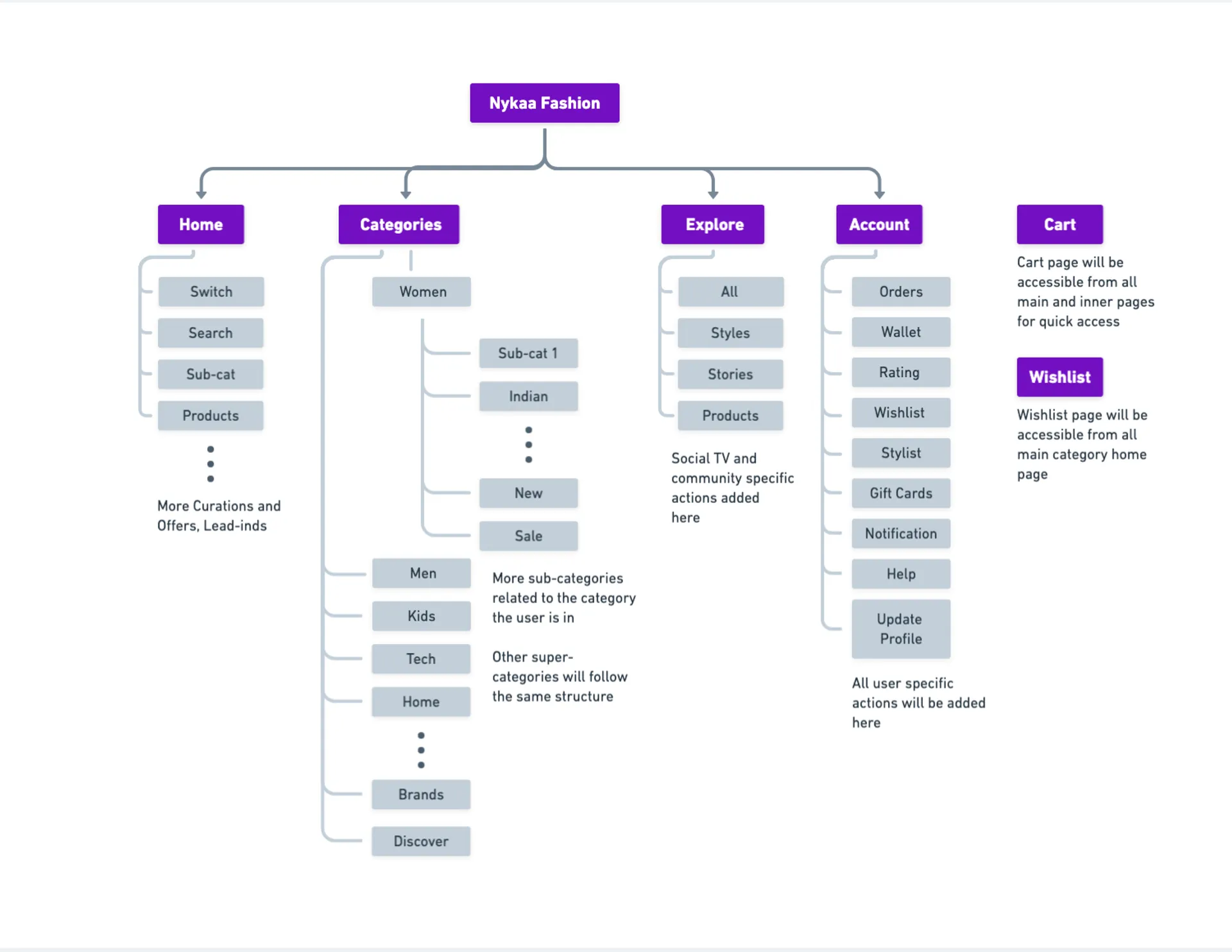
Redesigned information architecture for Nykaa Fashion web and mobile app navigation.
To get there, we regrouped categories around user intent and familiar mental models (instead of internal merchandising structure), rewrote labels to be clearer and more customer-facing, and reduced unnecessary depth by flattening overly nested sections. We also introduced a scalable category pattern so new brands and categories could be added without making the menu feel crowded or harder to navigate.
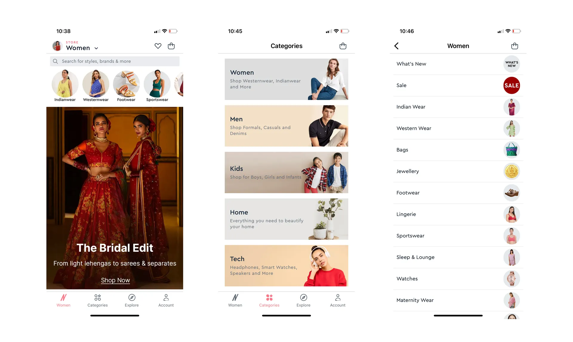
Redesigned navigation menu for Nykaa Fashion web and mobile app.
We made brand discovery feel “native” to browsing for our users. We added brand entry points within relevant categories and consistent linking between homepage modules → category/brand pages → product listings.
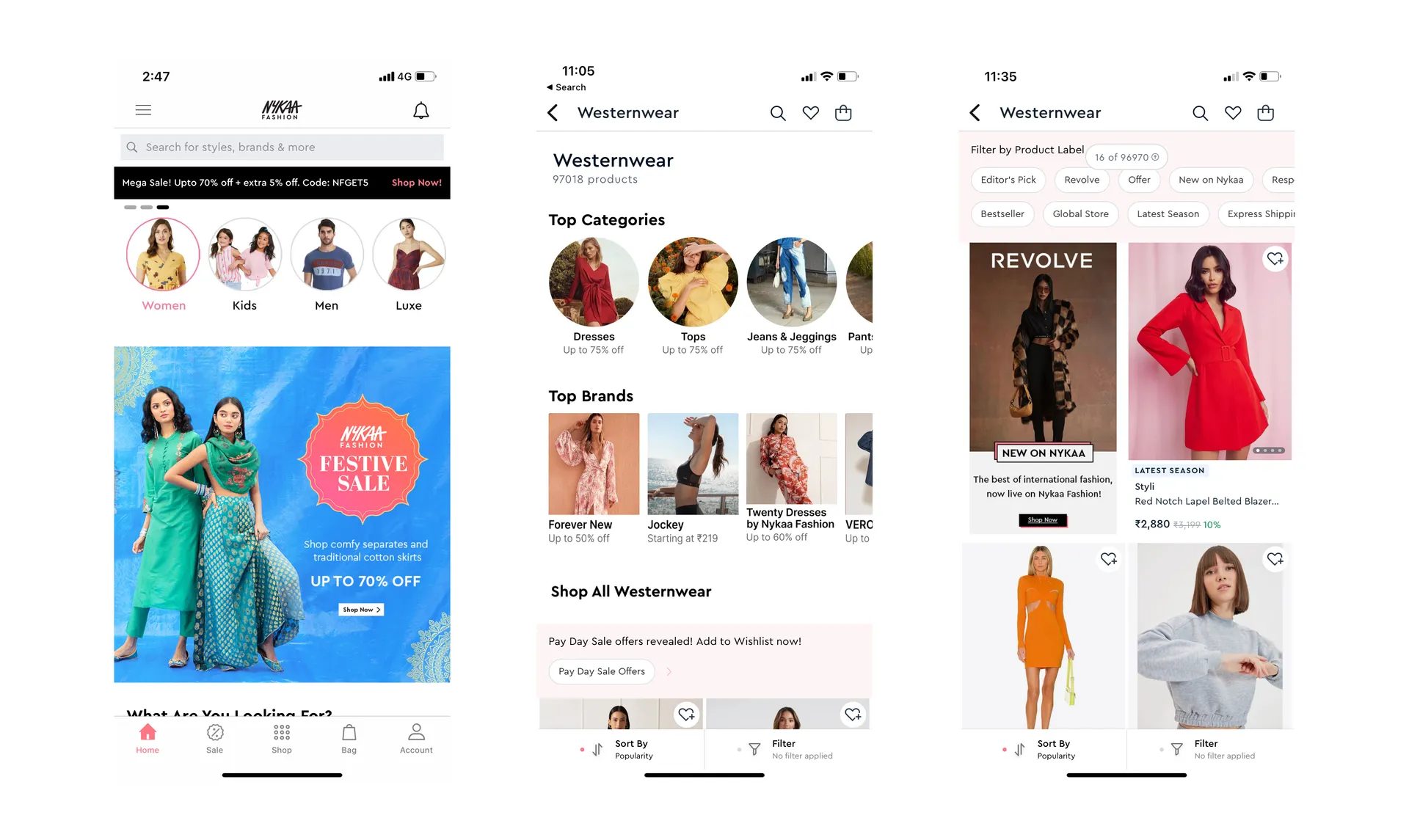
Redesigned navigation menu for Nykaa Fashion web and mobile app.
We tested multiple navigation variants through A/B experiments and tracked both discovery and purchase signals: click-through from the navigation to category and brand pages, product listing engagement (filter usage, scroll depth, product clicks), and downstream conversion metrics such as add-to-bag and purchase rate. Alongside the quantitative readout, we also used qualitative feedback loops from customer support and internal teams to catch confusion points that metrics alone wouldn’t explain.
Overall, the winning variant improved discoverability and made browsing feel more straightforward, with positive movement across engagement and conversion indicators. Just as importantly, the updated navigation was designed to scale, so we could add new brands and categories over time without bloating the menu or increasing user confusion.
Scaling discovery is as much an information architecture problem as a UI problem. And as always, pairing qualitative insights with funnel data made tradeoffs easier to defend.
Working on this project during the COVID-19 pandemic also showed me how important it is to stay flexible and stay connected with the team, even when we’re all remote. We ended up having tighter rituals (short feedback cycles, clear decision docs, more check-ins) which kept velocity up and made sure everyone felt aligned and supported.
There are other projects you can check out to see more of my work. Also, feel free to reach out if you'd like to work on something together!