Getting Your VR Legs
Designing a comfort-first VR onboarding experience to eliminate motion sickness.
Product Design, Game Design, HCI Research, Prototyping
Capstone Project for HCI Master's Program
Ever put on a VR headset and felt instantly nauseous? You're not alone. The first 15 minutes in spatial computing often decide if someone becomes a regular user or never touches a headset again.
From a product perspective, if your onboarding makes people physically sick, retention drops to zero before the core experience even begins. I wanted to solve this. Through user research and rapid prototyping, I designed a narrative-driven onboarding system that uses environmental cues to help first-time players naturally calibrate their comfort levels and beat motion sickness.
Role: HCI Research, Interaction Design, Prototyping (Solo Project)
Timeline: Aug 2024 - May 2025
Stack: Figma, Meta Quest VR, Unity (OpenXR), C#
Organization: Capstone Project for HCI Master's Program
Demo of the 'Getting Your VR Legs' onboarding experience.
The Problem
The 15-minute churn cliff.
VR promises total immersion, but for too many people, it delivers a headache instead. While headsets are getting lighter and screens sharper, the way we design movement hasn’t kept up. This leads to a massive, immediate drop-off.
The real impact on user retention.
The data paints a brutal picture of how product design currently fails new users:
80%
of users report motion sickness within their first 15 minutes of play.
37%
of returning users still struggle with nausea after multiple sessions.
67%
of study participants literally couldn’t finish a 14-minute simulation.
What’s actually happening: Sensory mismatch.
At its core, VR sickness is a biological glitch. When your eyes tell your brain you’re running, but your inner ear knows you’re standing still in your living room, your body panics. It interprets this conflicting sensory data as poisoning, which triggers the nausea and dizziness. We can’t rewrite human biology, but we can design product experiences that don’t trigger it.
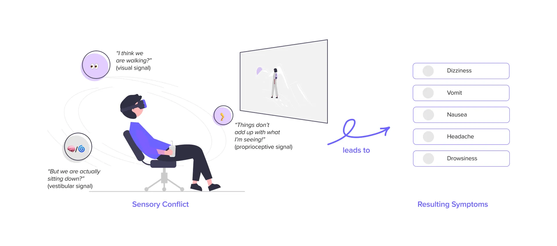
Illustration of sensory conflict theory explaining VR sickness.
Research
Why does current onboarding fail so badly?
Before sketching any solutions, I needed to understand exactly what interactions were making people rip the headsets off. I approached this like a standard product discovery phase, mixing qualitative observations with existing data.
1. Academic Literature Review
I dove into HCI papers on “simulator sickness” to understand the hard science.
The Takeaway: Pushing through the pain doesn’t work. It actually trains the brain to associate the headset with sickness. I realized our product strategy had to focus purely on early-stage prevention, not in-game remedies.
2. Scraping Community Sentiment (Reddit)
I spent hours auditing r/OculusQuest and other VR communities to see how real gamers hack their own nausea fixes.
The Takeaway: Players hack their setup by pointing a physical fan at their face or standing on a specific rug to feel “grounded.” This told me our virtual environments were fundamentally lacking spatial anchors.
3. Think-Aloud Observational Studies
I ran testing with five first-time VR users, dropping them into standard game tutorials and watching their physical reactions.
The Takeaway: Artificial turning (using the joystick to spin) was the number one trigger. Worse, buried comfort settings in deep menus meant users never turned them on. We had to make comfort “default and discoverable.”
4. Competitive Audit
I mapped out exactly how top games handle comfort settings (like tunnel-vision vignettes).
The Gap: Most games treat comfort as a harsh on/off toggle. My hypothesis was that a graduated approach—slowly easing constraints as the user builds confidence—would drive better long-term retention.
Design Pillars
Turning research into product strategy
I took all those scattered insights and boiled them down to three actionable product pillars. These became my guiding principles for every prototyping decision going forward.
1. Give them a sense of gravity (Environmental Grounding)
Users panic when they visually float. We needed a static frame of reference, similar to how sitting in a virtual cockpit miraculously reduces motion sickness in flight simulators.
The strategy: Use a persistent floor grid and robust environmental anchoring to give their brain a “safe” reference point during movement.
2. Don’t hide safety in a menu (Narrative Calibration)
Nobody wants to spend their first 5 minutes in a sterile settings menu.
The strategy: Build the comfort settings directly into the story. For example, adjusting your tunnel vision vignette shouldn’t be a slider in the UI; it should feel like “tuning your space helmet.”
3. Walk before you run (Graduated Exposure)
Tossing players into full-locomotion immediately is a recipe for a bad time.
The strategy: Execute a three-tiered movement system. Start safe (Teleportation), graduate to medium-risk (Linear motion), and only unlock free movement once the player physically demonstrates they’re ready for it.
"I didn't even know there was a 'comfort mode' I could turn on. By the time I felt sick, I just wanted to take the headset off completely."
— User from observational study
"The camera spinning made my stomach drop instantly. I tried to close my eyes, but the damage was done."
— First-time VR User
"I kept accidentally pushing the joystick. The unexpected movement threw me totally off balance physically."
— Novice Player
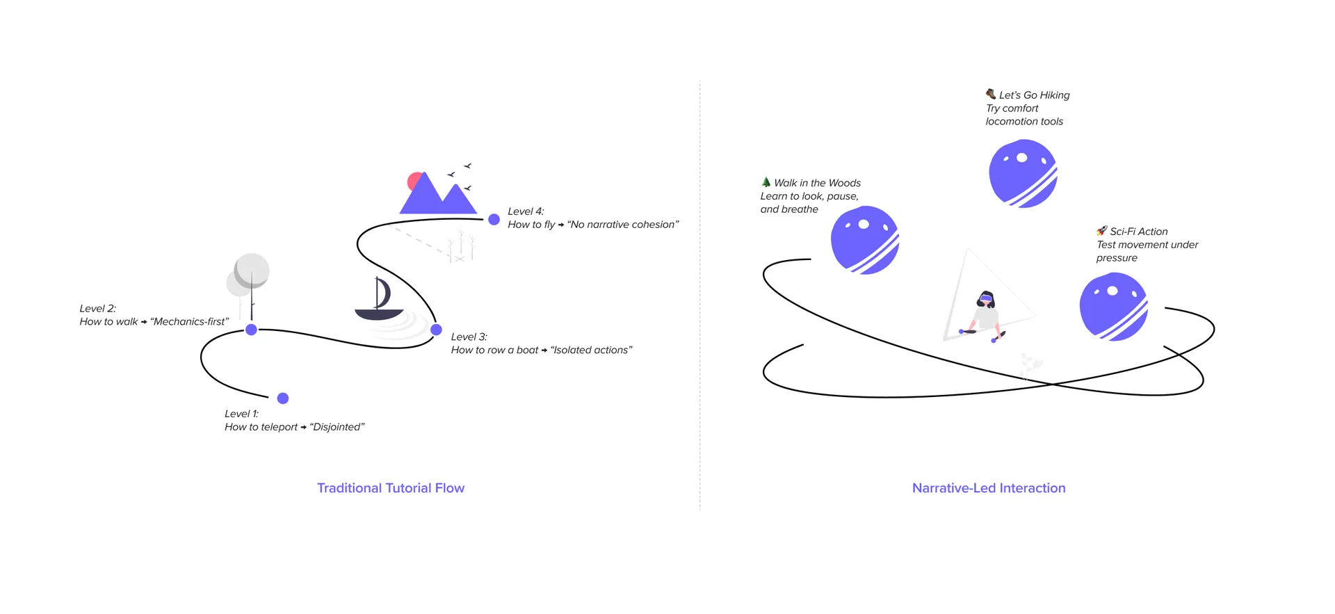
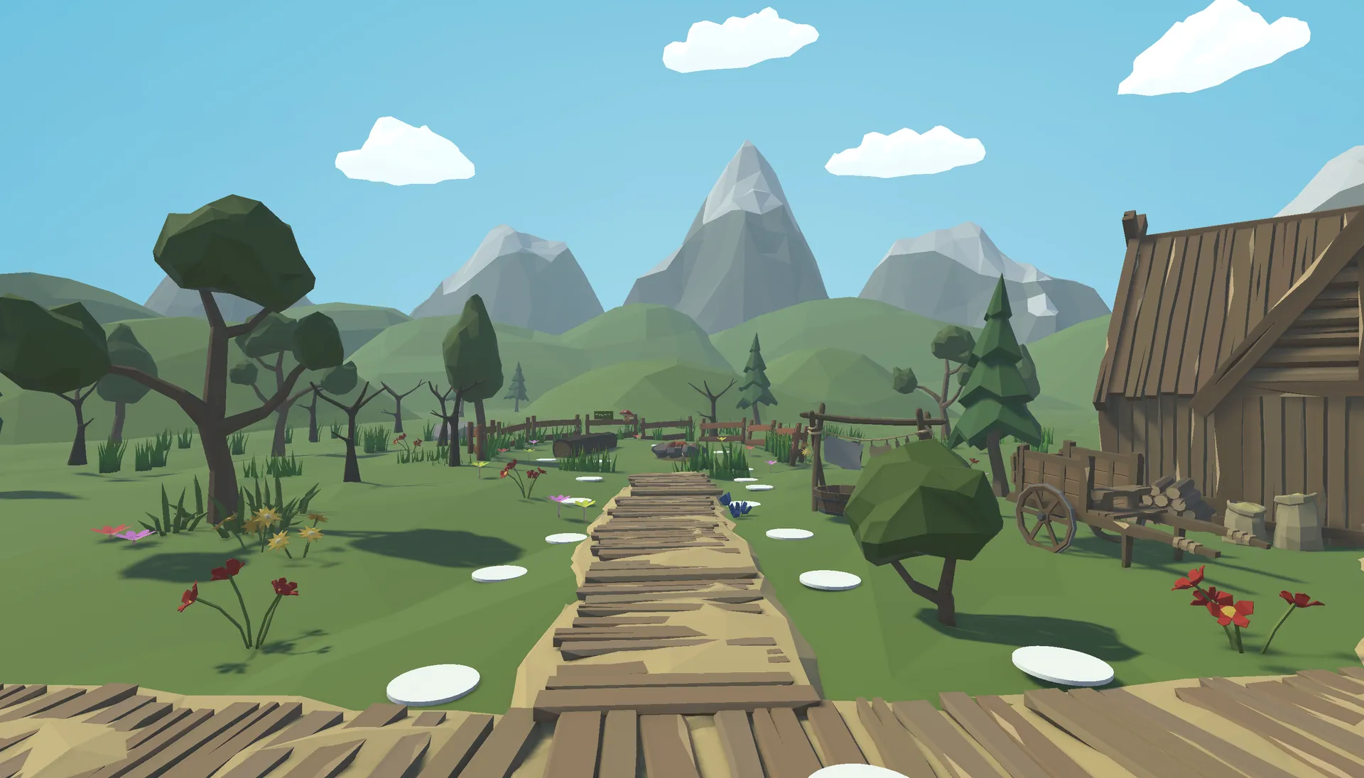
Design concepts for a narrative-led VR onboarding experience.
Scope and Constraints
Working with what we have
Things like lighter headsets and higher refresh rates definitely reduce nausea, but as a product designer, I couldn’t rebuild Meta’s hardware.
I strictly constrained the project to software interaction design. The goal was simple: How far can we push retention and comfort using only design, narrative, and pacing on existing, lower-end consumer hardware?
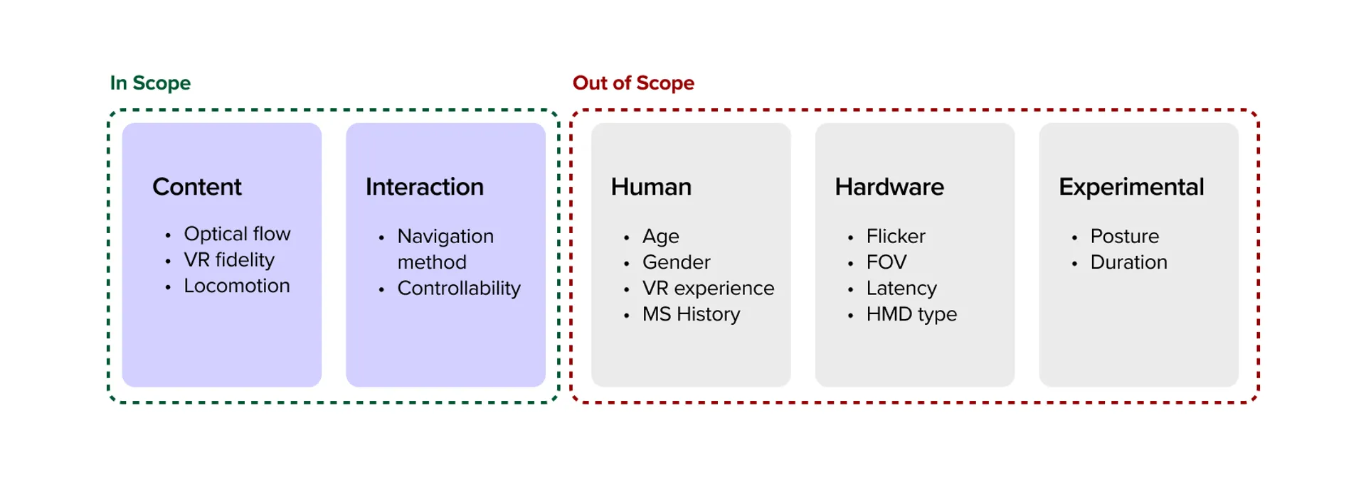
Scope of this project focusing on interaction and content pacing.
Prototyping & Pivots
Iterating through failure
Before committing to a polished build, I spun up incredibly ugly, functional Unity scenes just to test the core mechanics. Validating the interaction “feel” alongside users was way more important than visual polish early on.
My biggest pivot: Scrapping the “tutorial” track
Watching early testers play these grey-box prototypes completely changed my direction. I initially designed a standard, linear onboarding track that moved at a fixed speed. It failed miserably.
Some users got their “VR legs” in two minutes. Others needed ten. Forcing a slow user through a fast tutorial made them sick; forcing a fast user through a slow tutorial made them bored and frustrated.
The pivot: I grabbed the reins and completely scrapped the linear tutorial. I rebuilt a self-paced, narrative-led environment where the user dictates the speed. They only advance when they explicitly opt-in.
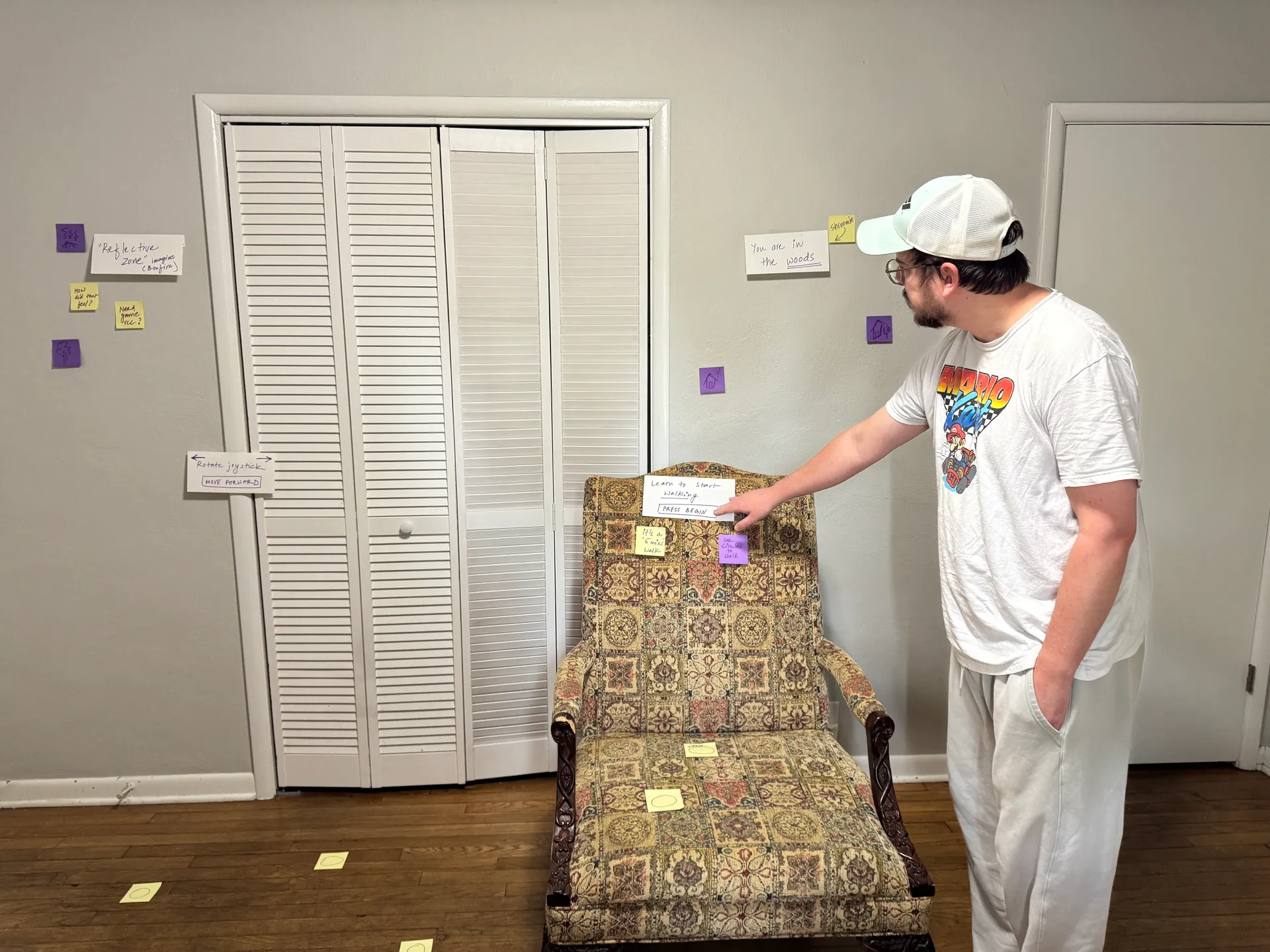
Bodystorming session capturing user interactions and feedback.
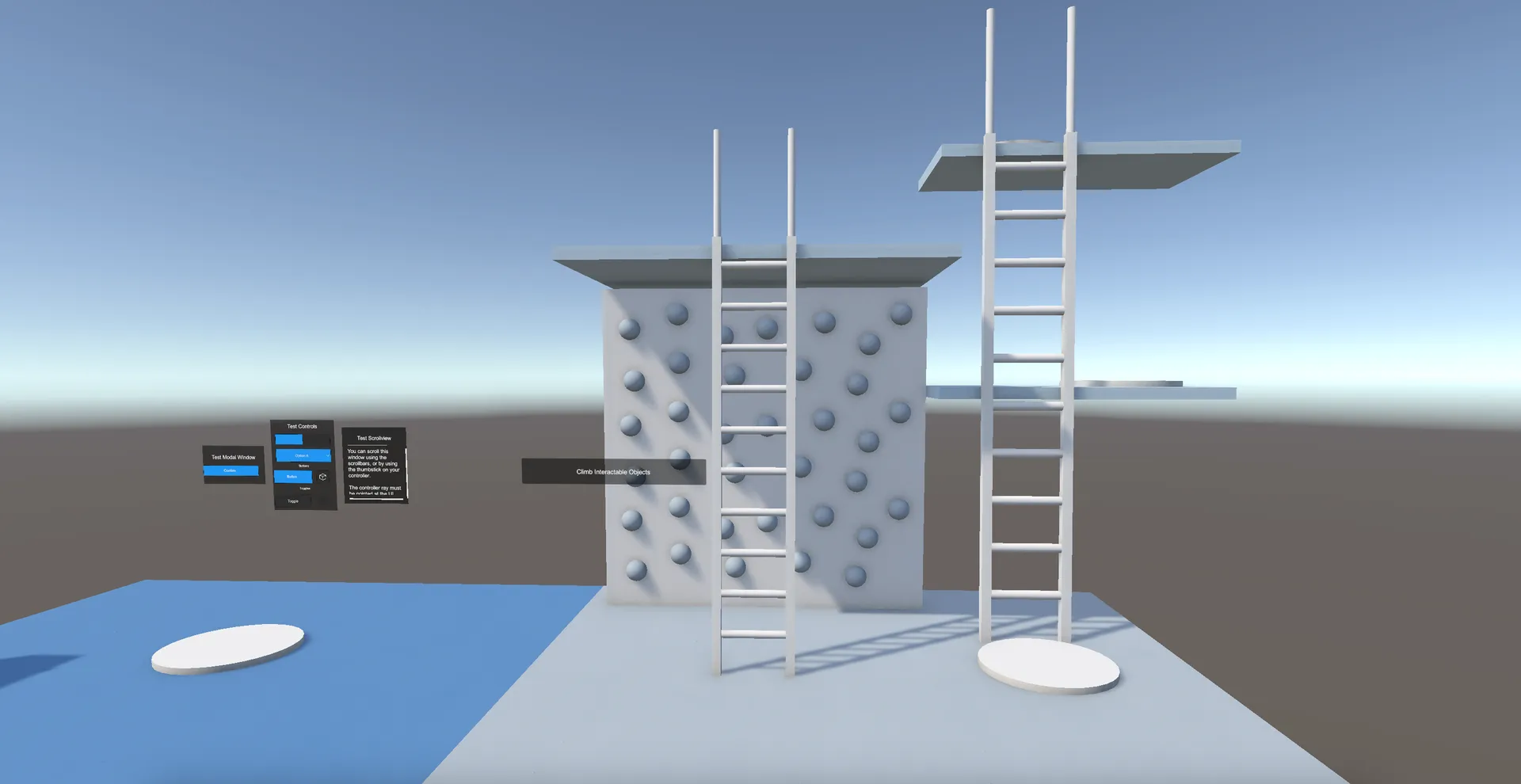
Early Unity prototype for testing the graduation pacing.
The Final Product
A narrative path to your VR legs
The final experience is a multi-stage Unity environment that disguises an intensive onboarding system as an engaging story. By wrapping comfort mechanics inside the world-building, the system manages the user’s physical state entirely without breaking immersion. Here’s how it flows:
1. The Gentle Start
Meet Shroomie (Low Cognitive Load)
Instead of bombarding the player with UI screens and button prompts, the experience opens quietly with a friendly guide. It’s an intentionally low-stimulus environment.
The product reasoning: By pulling way back on sensory input in the first 30 seconds, we stop the user from rushing around. This lets them naturally acclimate to the sheer visual scale of VR without feeling overwhelmed or anxious.
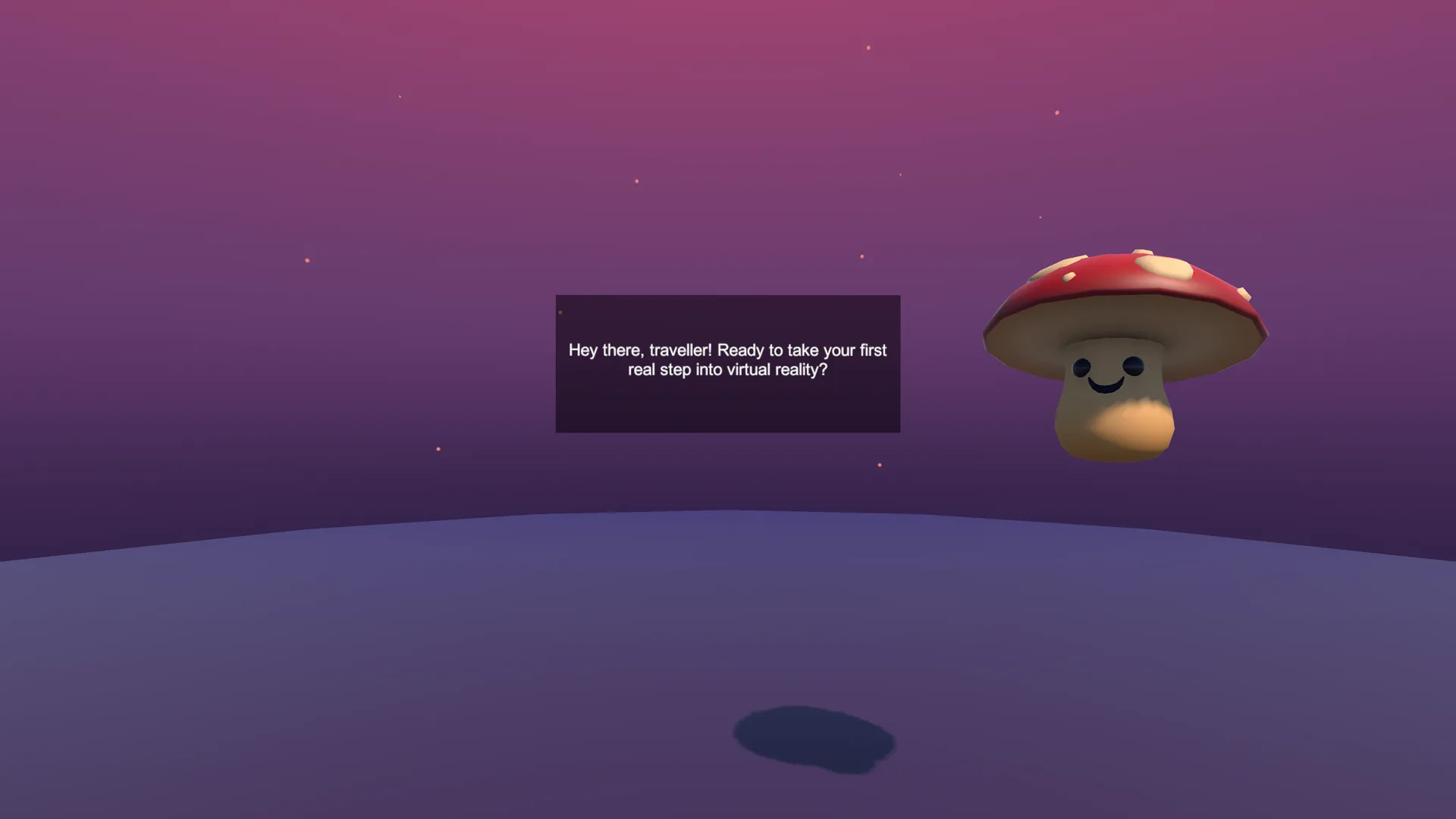
Calm visuals and lightweight prompts reduce cognitive load and establish self-paced progress.
2. The Buffer Zone
The Portal Room (User Agency)
This is a transition space where absolutely nothing forces the player to move. They have total agency.
The product reasoning: Grounding. Letting players stand stationary and look around for as long as they want allows their depth perception to fully calibrate. They only step through the portal and initiate deeper movement mechanics when they decide they’re ready.
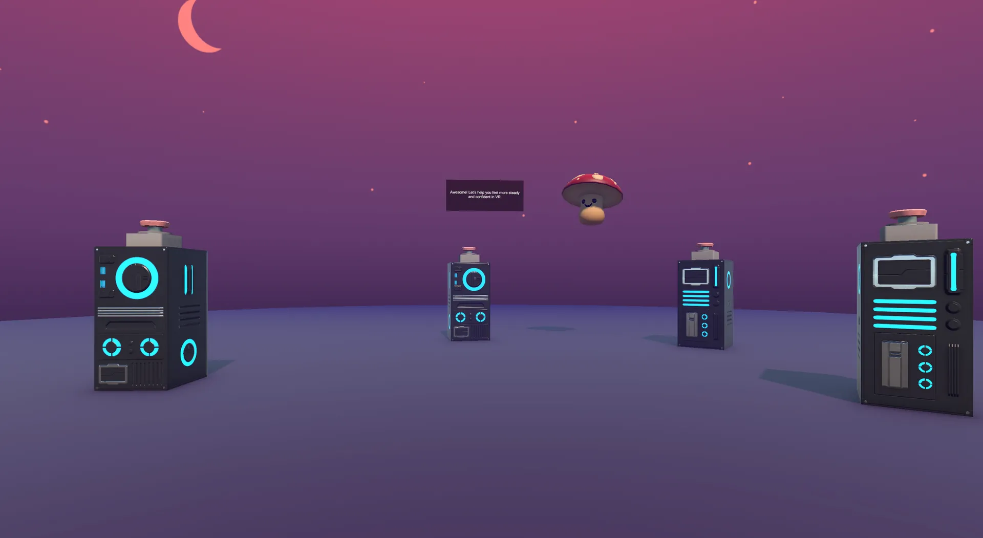
A self-paced space to build orientation: the choice to explore first, then opt into movement.
3. Telegraphing Moves
Anticipatory Cues
When users finally do start walking through the forest, the environment actively telegraphs exactly where the camera is going next.
Finally, the journey wraps up by having the player simply sit still at a warm, stationary bonfire.
The product reasoning: Surprising the vestibular system is exactly what makes people sick. By clearly signaling turns and stops in advance, we eliminate the visual shock.
Ending at a stationary fire is highly intentional: it leaves the user with a final “biometric snapshot” of calm equilibrium, deeply increasing the statistical chance they’ll come back for session two.
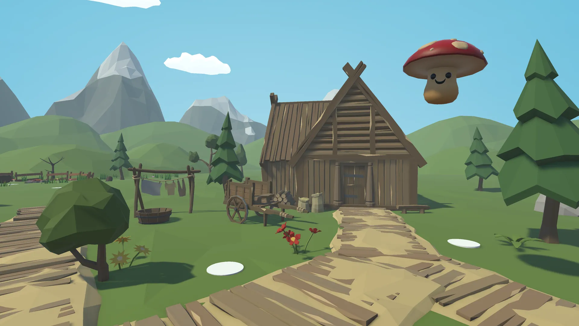
Guided movement in a low-pressure environment.
Anticipatory cues to help users feel more comfortable and in control.
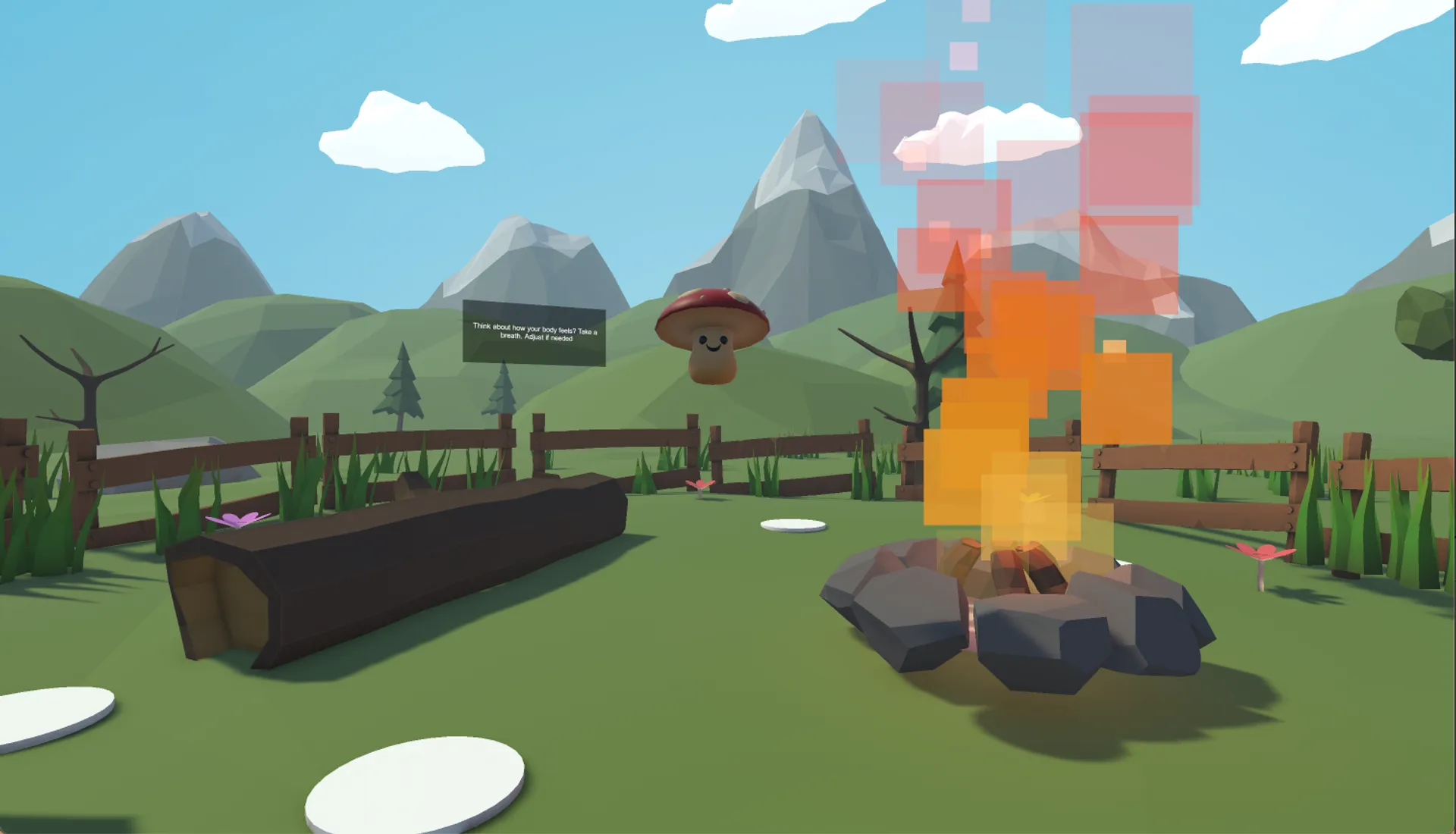
Ending with stillness to reinforce comfort before users enter complex gameplay.
Validating the UX
We don’t launch on assumptions. I put the final Unity prototype in front of a fresh set of five complete novices to track its actual impact.
I captured pre- and post-session comfort ratings alongside qualitative hesitation metrics (watching closely for things like: when did they freeze up? When did they look frustrated?).
The narrative framing and anticipatory cues worked beautifully. The “what do I press next!?” anxiety practically vanished.
The Results: Every single participant reported a measurable increase in comfort and confidence by the end of the session. More importantly, several explicitly mentioned feeling ready to launch a “real” high-intensity game immediately afterward. We had successfully built their VR legs.
"I usually feel lightheaded after 5 minutes in VR, but the way this eased me in made a huge difference. I actually want to keep playing."
— Tester #1
"I didn't have to fiddle with any menus. The game just let me stay in the portal room until my eyes adjusted."
— Tester #2
"Sitting at the bonfire at the end was really smart. I took the headset off feeling calm, not dizzy."
— Tester #3
Professional Recognition
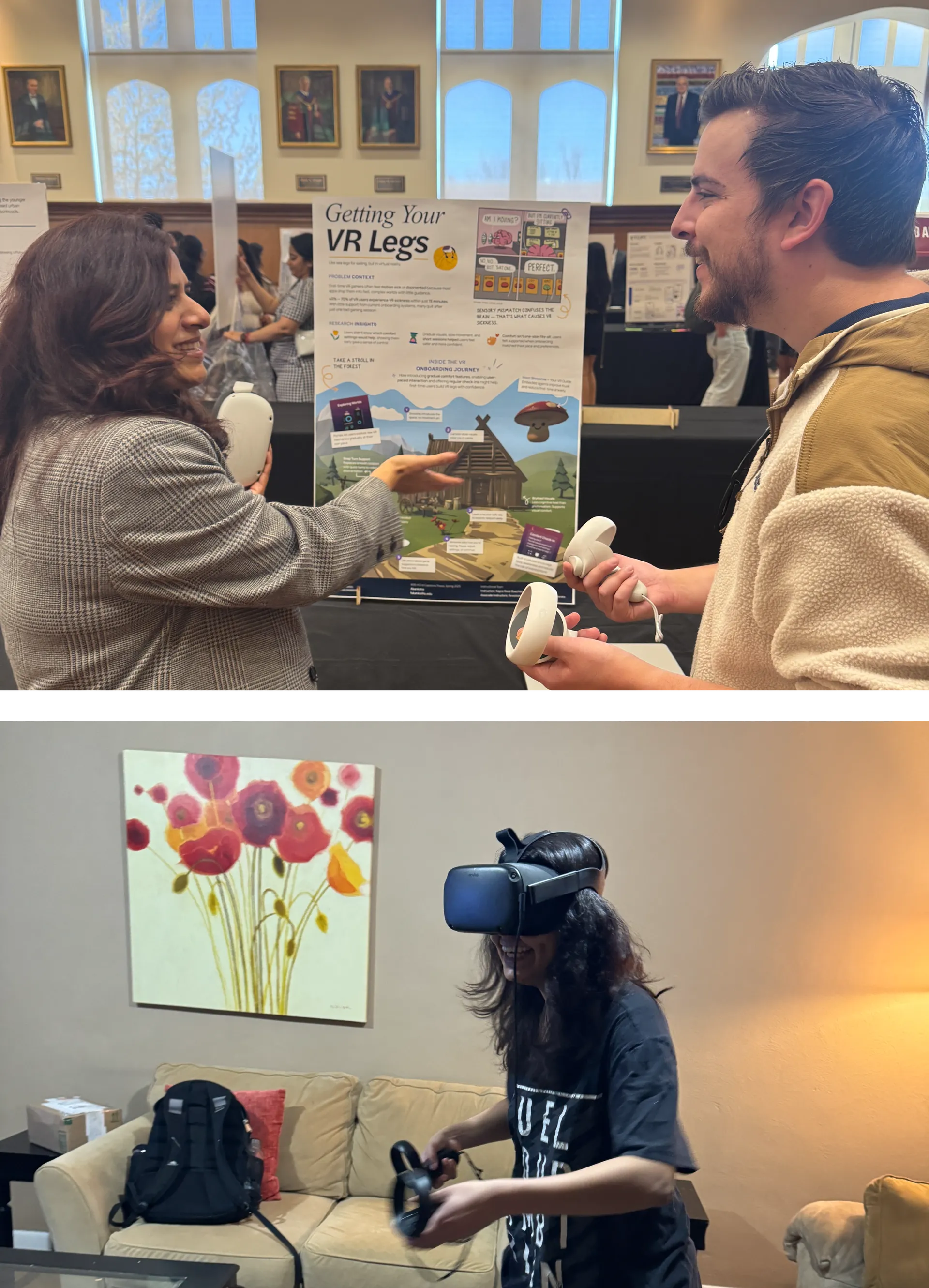
Sharing the work with the HCI community
I presented this project at the HCI/d Poster Fair. It was highly validating to see the prototype recognized for turning dense academic theory into a tangible product. Professor Erik Stolterman Bergqvist even noted how the experience felt exceptionally grounded in real user testing, proving the effectiveness of narrative-led product design.
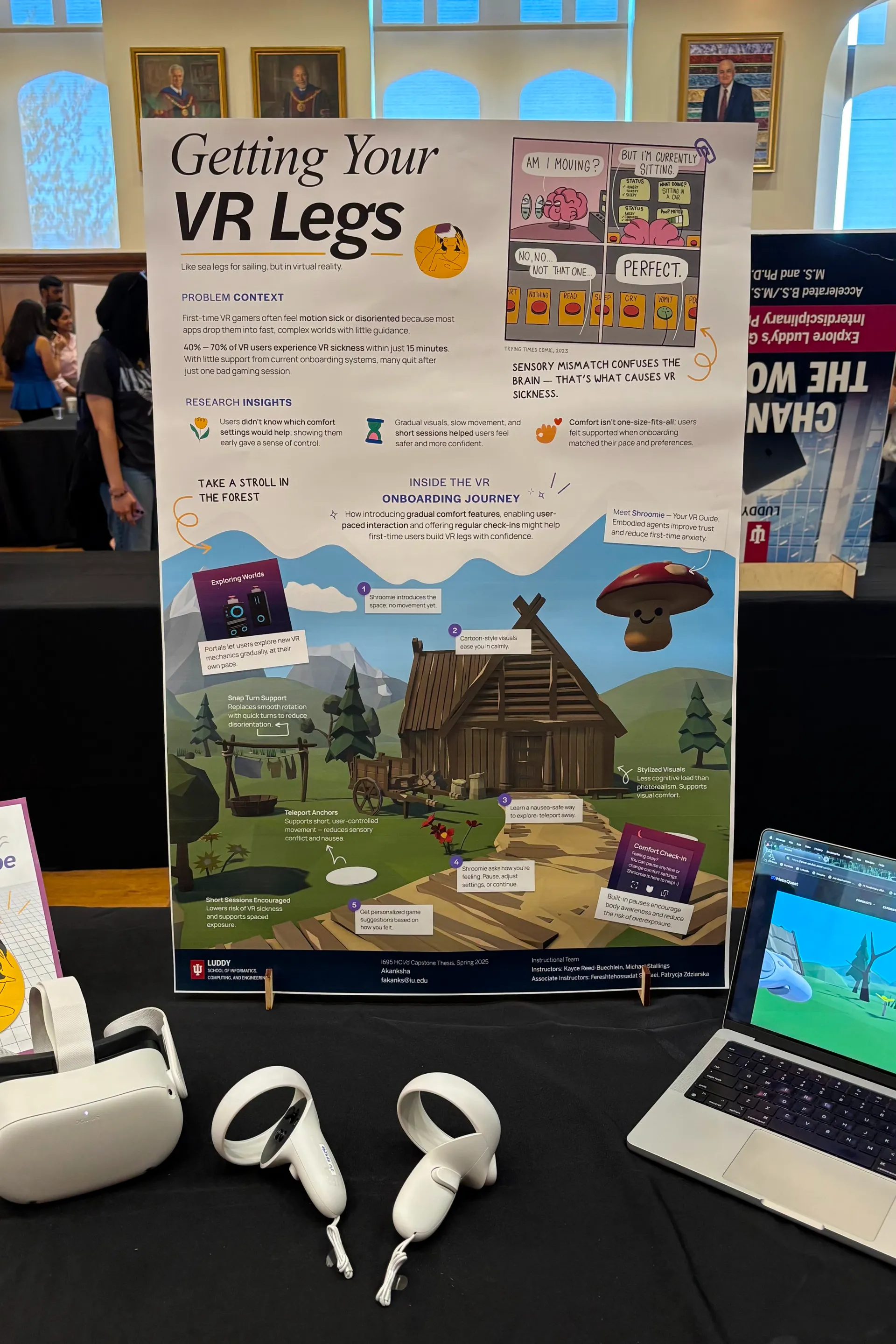
VR demo setup for the HCI/d Poster Fair.
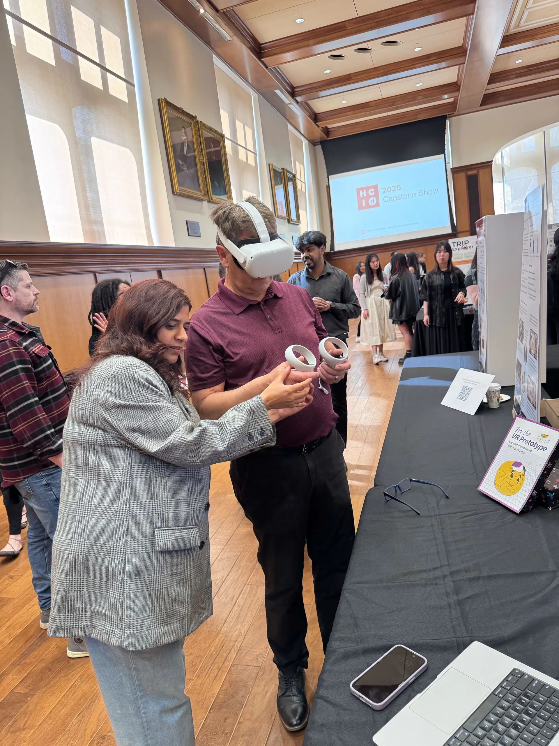
Prof. Erik Stolterman Bergqvist trying out the VR prototype.
Takeaways
Biology dictates the UX
In 2D web design, bad UX causes drop-offs. In spatial computing, bad UX causes physical pain. I learned to treat human physiology as the absolute hardest constraint in the product requirements document.
Narrative is the best tutorial
Settings menus are friction. By wrapping accessibility features inside the world-building (e.g., “calibrating your helmet” instead of “turning on the vignette filter”), we gained dramatically higher adoption rates of comfort tools. Immersion and accessibility don’t have to compete.
Agency over pacing
My biggest failure early on was trying to strictly choreograph the user’s timeline. Handing the throttle back to the user and letting them progress exactly as fast as their stomach allowed was the biggest product unlock for the entire experience.
Next Steps
Where I’d take this product next
Biometric feedback loops: Integrating smart watch heart-rate monitoring to automatically throttle gameplay speed if the system detects signs of physiological stress in the user.
Dynamic physical anchors: Testing whether specialized haptic pulses in the hand controllers could successfully simulate the sensation of gravity during high-velocity movements.
Thank You Note
I’ll always be grateful to my teaching team and friends for pushing me on this.
I started this purely as an academic research exercise, but it rapidly evolved into building my very first VR prototype in Unity—something I honestly never expected to do. The leap from research concept to a working product taught me to trust my instincts as a designer, even when the software learning curve feels steep.
Prof. Kayce Reed-Buechlein giving feedback on the VR prototype.
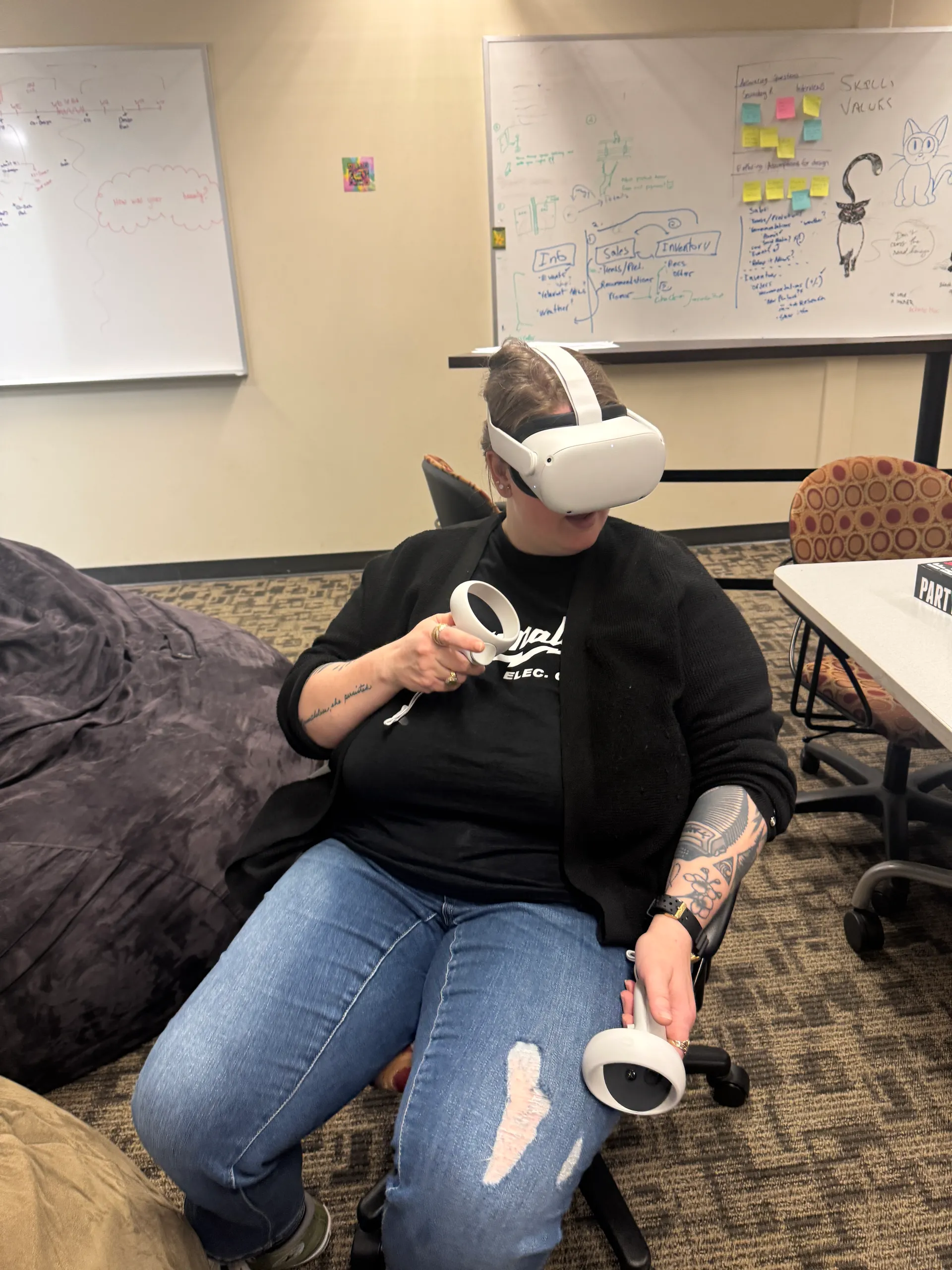
My friends trying out the final VR prototype.
Fin.
There are other projects you can check out to see more of my work. Also, feel free to reach out if you'd like to work on something together!
